Trending Colours for Kitchens, Bathrooms and Laundries

Kitchen, bathroom and laundry colour trends over the past few years have seen the bright white movement being coloured out. It started with splashes of colourful accessories and homewares. Then, people became braver and introduced more colour with tiles and coloured cabinets, tapware and basins.
Last year’s colours were inspired by nature: soft blues, greens, coral, timber and stone. Now, the latest colour trends take these nature hues to a new level.
If you want the latest look, try to incorporate one or more of these:
| Green | Blush |
| Calico | Teal |
| Yellow | Slate |
| Amber | Cherry |
| Clay |
Colours Inspired by Sustainability

- Green
- Calico
- Yellow
Even when it’s cold and wet outside, green, calico and yellow will make you feel all warm and summery.
We’re not talking highlighter yellow here (although, no judgement from us if that’s what you like). We’re talking something a little softer like custard or buttery yellow.
Nood Co is an Australian brand of colourful designer basins and we think Nood Co basins in custard are a perfect example of on-trend yellow. Another great way to use yellow is with rugs, towels and tea towels. Make them shine by choosing chrome or stainless-steel tapware and accessories, definitely not gold.
Yellow works really well with neutral tones like calico. This is a more rustic take on bright white, reflecting the growing interest in sustainability and upcycling. Look for calico hues in tiles, paint or kitchen cabinets. For basins, Johnson Suisse cream-coloured products or the Nood Co sand-coloured products are good examples. We also can’t go past Raymor vanities in Amaro.
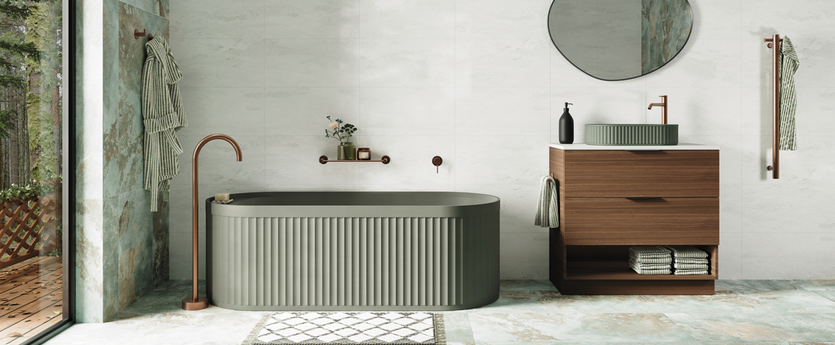
As for green, it’s a classic choice. However, the take on green is a little less foresty or limey and a little more, hmmm, garden tool green you could probably say. It’s a stunning and bold choice for walls or splashback tiles. Sage is also trending. Caroma has a beautiful range of basins in matte green that are definitely worth exploring.
Warmer Colours of Nature Across Different Seasons

- Amber
- Clay
- Blush
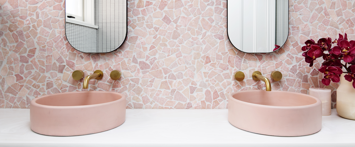
Last year’s nature tones were soft and subtle. This year’s nature colours branch out in stronger, earthier ways. For that, you can’t look past rich orange-brown flavours like clay, terracotta and burnt sienna. They create a multicultural, autumnal feel, especially when matched with glowing shades of amber and blush pink.
For a dramatic kitchen feature, check out this Fienza sink mixer in matte autumn . Make it work with a white sink, blush pink cabinets, and amber décor.
In the bathroom, clay-coloured basins like these from Nood Co will be just as striking.
For something more subtle, consider using blush pink feature tapware and accessories. The Phoenix Zimi range features blush pink as one of its nine interchangeable finishes for mixer taps, shower mixers, and outlets.
Colours that Reflect Our Digital World

- Teal
- Slate
- Cherry
Technology leaps are changing the way we work and pamper ourselves in kitchens, bathrooms and laundries. And while we love sensor taps and smart-tinting shower screens, we still want to stay attuned to the natural world. These deep tones of teal, slate and cherry seem to create the perfect balance of contemporary style and the great outdoors.
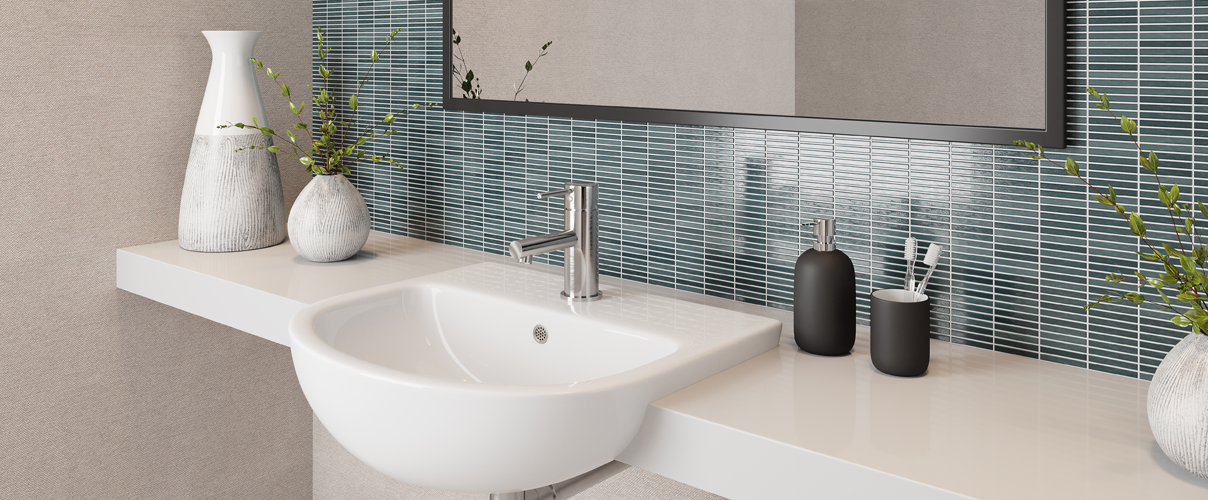
The deep-sea shade of teal is a clever choice for bathrooms. It works beautifully as a feature wall against grey or slate-coloured tiles. Or, you guessed it, shop Nood Co for vibrant teal-coloured basins .
For tapware, look into graphite finishes. In the bathroom, Nero offers a beautiful selection of showers, mixers and basin sets in graphite finish . This colour range carries into the kitchen for Nero sink mixers .
Cherry is probably the most unique introduction to this year’s colour trends. Steer clear of retro primary reds and look for earthier shades. For such a bold choice, you might prefer to use it as an accent colour with things that are easy to change, like towels and vases. Unless of course you know for sure that you will love a bold cherry-red feature tiled wall just as much in five years as you do right now. For some of you, images of Nonna’s red kitchen bench tiles might still be haunting you.
At the end of the day, choose colours that make you feel happy every time you walk into the room.
If these colour trends tell us anything, it’s that there’s something out there for everyone.
Suppliers are using new materials and technologies to introduce exciting new colours to their ranges. This gives you more freedom than ever to inject your own personality into your kitchen, bathroom and laundry designs.
These colours are definitely not playing it safe. They are bold and confident. If you want to follow the trends, our best advice is to remember the 60-30-10 rule for decorating. Choose a main colour to dominate about 60% of your space, like walls. Your secondary colour fills about 30% of your space, like cabinets. The final 10% goes towards your accent colour for tapware or other accessories.
Creating a mood board is the best way to play around with this balance. Luckily for you, we have a Style Sourcebook Moodboard Tool to help you out.
Shop the lot and get great advice from Tradelink showrooms and specialists in-store at our Tradelink showrooms.
Happy colouring!

